NURSERY DESIGN
A Modern Neutral Nursery Design That Soars With Personal Touches
A sophisticated palette plus a subtle high-flying theme come together beautifully in this modern neutral nursery design.

Written by
Happiest Baby Staff
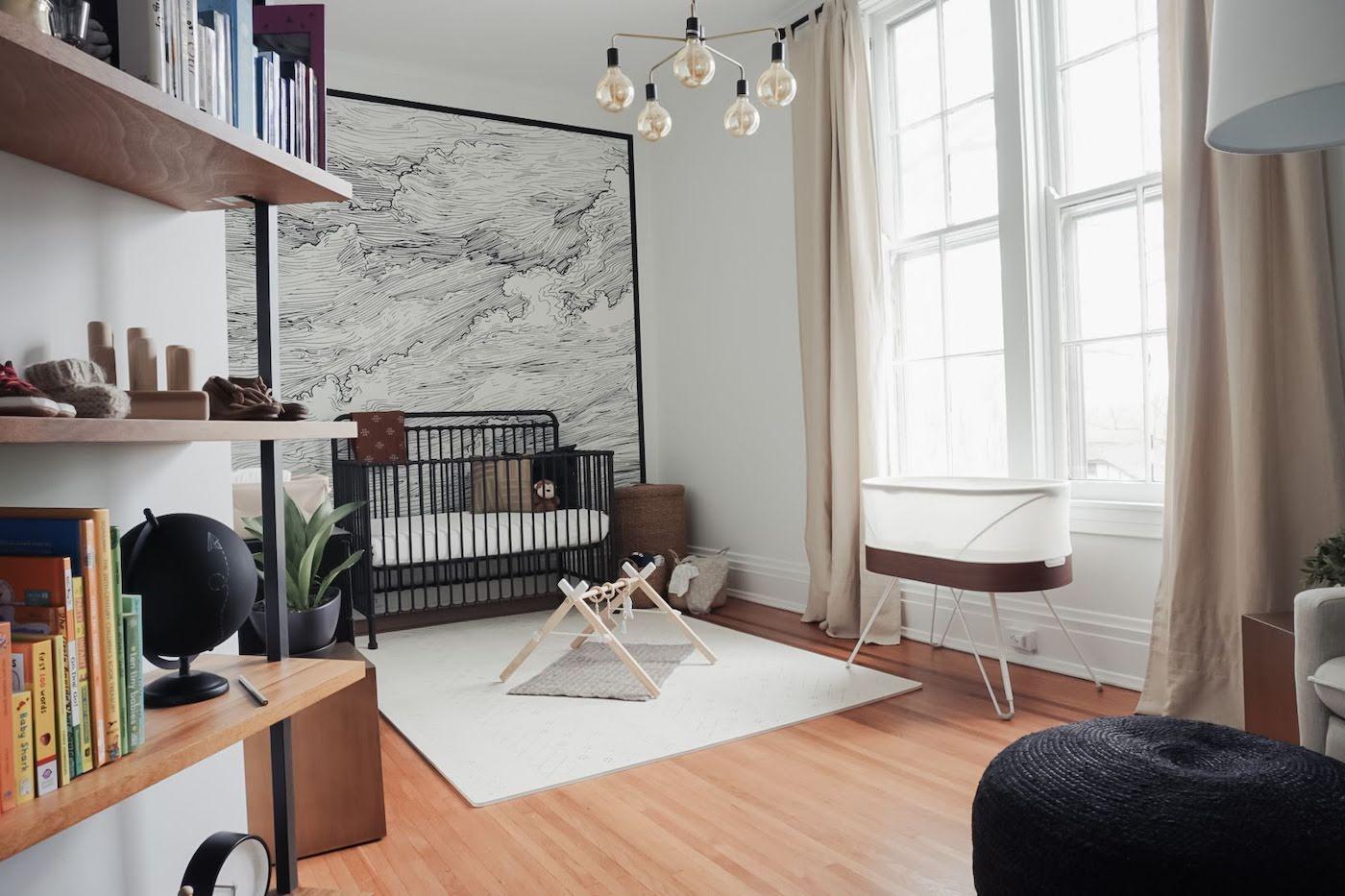
Note: While these nursery photos are gorgeous, please know that it’s NOT safe to place stuffed animals, pillows, bumpers, or any loose items inside your infant’s sleep space until Baby is a year old. —Dr. Harvey Karp
A sophisticated palette plus a high-flying theme come together beautifully in this modern neutral nursery.
Jessie Salzbrun, the mum behind the design, works in technology by day, but dabbles in home design and renovation on the side. She has always been a fan of modern neutrals and has felt especially inspired by her home—a historic charmer that was built in 1853. 'We tried to maintain historic integrity and update it and bring it into modern times. One way we did that was keeping it pretty neutral.'
She extended her signature aesthetic into her son Jett’s room—which is deliberately neutral both in terms of colour and gender. 'We knew we were having a boy, but I didn’t want a traditional masculine-themed nursery,' Salzbrun says.
![[object Object]](https://cdn.sanity.io/images/301lhh0a/production/8f6008f353a0704e6db89957f64a6babe3241876-480x321.jpg?w=1080&auto=format&q=75&fit=max)
She worked off of inspiration images, which she brought to life with touches that were 100% her own. 'I did a lot of Ikea shopping, DIY, and piecing cost-effective things together, but on items that were really important, we made the investment,' Salzbrun says.
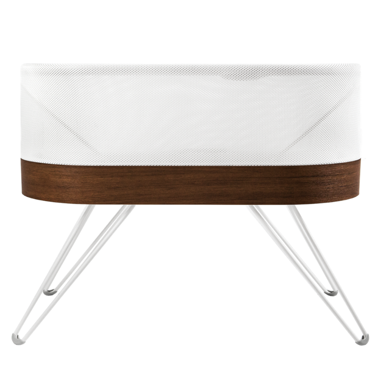
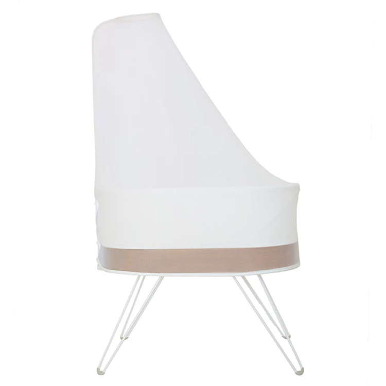
SNOO was one of these worthy investments.
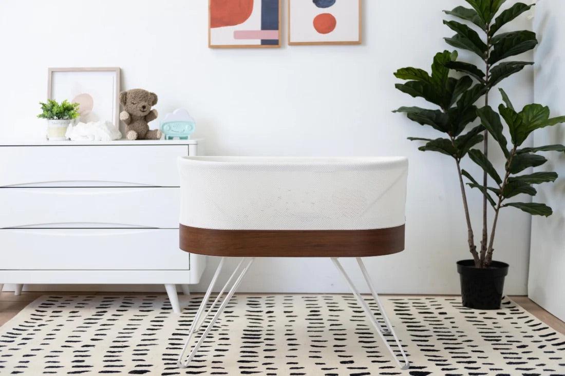
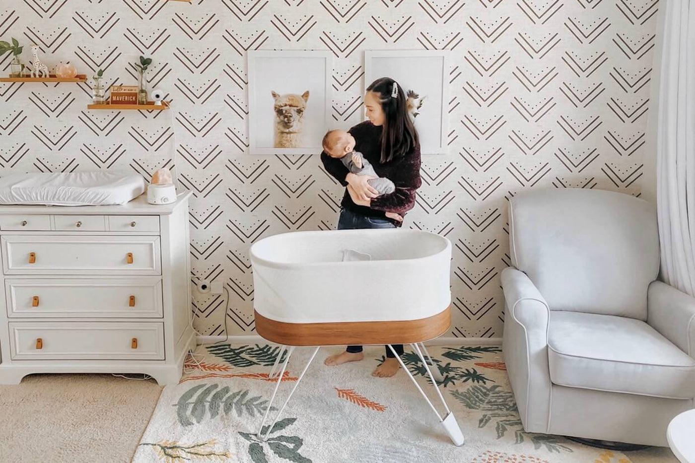
'There are a million and one cot options, but so many don’t have the same aesthetic that I like to maintain. The SNOO is such a beautiful piece of technology, and it’s safe,' she says. 'I can’t put a price tag on my own peace of mind and the safety of my child. That’s what pushed it over the top and made me pull the trigger…knowing he can’t get himself in a precarious position is amazing peace of mind for a mum' she says.
![[object Object]](https://cdn.sanity.io/images/301lhh0a/production/0998b2d534d0a6c89a0425e038f7c9896ad1f7d6-480x321.jpg?w=1080&auto=format&q=75&fit=max)
Her son served as major nursery design inspiration as well.
'Our son is named Jett, which was my nickname as a child, so we wanted to have at least a subtle nod to his name in the room, without going over the top.' Salzbrun made one such nod with the paper airplanes soaring above the nursery glider. She found the paper airplanes at Pottery Barn Kids.
![[object Object]](https://cdn.sanity.io/images/301lhh0a/production/dce5b8401162c0815d6f395718d5f6c936cbc086-480x321.jpg?w=1080&auto=format&q=75&fit=max)
Similar to the way the paper airplanes were inspired by her son’s name, so was the accent wall behind Jett’s crib. 'It’s a sky, but a more artistic version—not just blue and white clouds,' she explains.
After searching high and low, Salzbrun found the perfect self-stick wallpaper on Etsy. She initially intended for it to go floor-to-ceiling and wall-to-wall, but her measurements were slightly off (Salzbrun blames pregnancy brain!).
'When it was being installed, I got a call saying it was a little short on the width,” she recalls. 'So, we improvised, and I’m glad we did. We trimmed it in a little and added some inexpensive quarter-inch plywood as a frame around it. The result was an accident, but it turned out to be a good thing.'
![[object Object]](https://cdn.sanity.io/images/301lhh0a/production/16692eacb4d351ff54562c9d87f094c333185e44-480x321.jpg?w=1080&auto=format&q=75&fit=max)
For the changing table, Salzbrun found a flat filing cabinet that she loved, but because of its steep price and impracticality (she knew that the narrow drawers would not give her the storage space she needed), she decided to make a dresser instead.
She found an unfinished dresser at Ikea that she stained. Then, she cut little grooves and added pulls she found on Amazon to make it look like it had 18 drawers instead of six. 'The dresser still has three deep drawers but has look of flat filing cabinet and was affordable with a little elbow grease,' she says.
The art above the changing table has a story, too. 'My husband and I loved the idea of having honorable men who might one day be my son’s heroes hanging on the wall above his changing table so he could look up to them,' Salzbrun says.
They started with a list of about 20 men and whittled it to five. Each one embodies a quality or value they want to instill in their son, whether it is Neil Armstrong for his courage or Freddy Mercury for not being afraid to be himself. Once they chose their five men, Salzbrun created the artwork herself and framed them using inexpensive frames.
![[object Object]](https://cdn.sanity.io/images/301lhh0a/production/14c91fdaa21df93bf2b3ac85fb77a37bdb29108d-480x321.jpg?w=1080&auto=format&q=75&fit=max)
The table lamp was another Ikea find. 'I love the fact that it was green and had a vintage look to it,' she says. “As much as I love neutral, pops of colour are good. I included colour in a couple of places with green in a pillow, lamp, or plant.”
In addition to adding style, the table lamp has utility, Salzbrun learned early into motherhood. Because it is equipped with a dimmer, it allowed Salzbrun to use very low light during middle-of-the-night nappy changes that would not fully wake her son. 'It was a happy accident because it was more of a design choice,' she says.
Another way Salzbrun introduces little pops of colour is with greenery—half of which is real, and half is not. 'When you’re trying to keep a kid alive, sometimes your plants take a backseat,' she says. 'I’m not above leveraging inexpensive and long-lasting faux greens that I don’t have to maintain!'
![[object Object]](https://cdn.sanity.io/images/301lhh0a/production/1d64bd78f2a73348326e15fca66b6c357ee38531-480x321.jpg?w=1080&auto=format&q=75&fit=max)
A few other details round out this subtly-aviation-themed modern neutral nursery. The black globe was an inexpensive Ikea find that Salzbrun personalised with a chalk pencil.
![[object Object]](https://cdn.sanity.io/images/301lhh0a/production/18f55b2618c2469e4fbd913f9f08352b7a6b8b5d-321x480.jpg?w=750&auto=format&q=75&fit=max)
To fill space on an empty wall, Salzbrun found inexpensive walnut hooks. 'I wanted something to hang things on this giant wall that had nothing on it,' she says.
For other expecting parents who are mapping out their own nurseries, Salzbrun’s words of wisdom are simple: 'The best advice I could give is to spend a lot more time than you would think to gather inspiration and ideas. Don’t be afraid to copy bits and pieces of things you like,' she says. 'You’re not trying to replicate an entire design detail by detail, but there’s no harm in finding things you enjoy and piecing together inspiration to make it your own.'
Disclaimer: The information on our site is NOT medical advice for any specific person or condition. It is only meant as general information. If you have any medical questions and concerns about your child or yourself, please contact your health provider. Breastmilk is the best source of nutrition for babies. It is important that, in preparation for and during breastfeeding, mothers eat a healthy, balanced diet. Combined breast- and bottle-feeding in the first weeks of life may reduce the supply of a mother's breastmilk and reversing the decision not to breastfeed is difficult. If you do decide to use infant formula, you should follow instructions carefully.
SHARE THIS ARTICLE
PARENT PICKS
Bestsellers
